Customising Your Payroll Savings Plugin
In order to make your users (or your customer’s users) feel as much as home possible, this document will guide you through the areas of our Payroll Savings Plugin that can be customised.
Use this guide in parallel with the themes data spreadsheet provided by your sales/integration manager.
Table of contents
🎨 Colors
Primary is applied extensively throughout the Plugin and is recommended to be a recognisable brand colour that would make the user most feel at home.
Below are number of examples of the application of the primary colour in our own Sync Turquoise:
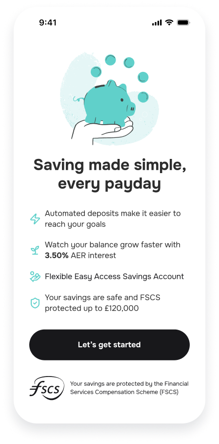
Bullet Icons and Graphic base colour on the Landing Explainer Screen
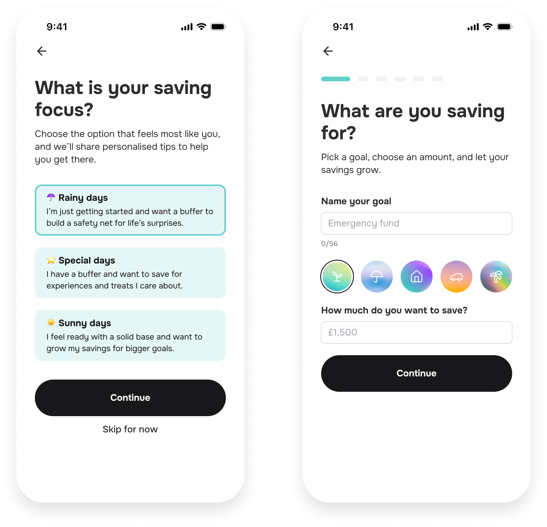
Border of a selected Card and the Progress Stepper (Breadcrumbs)
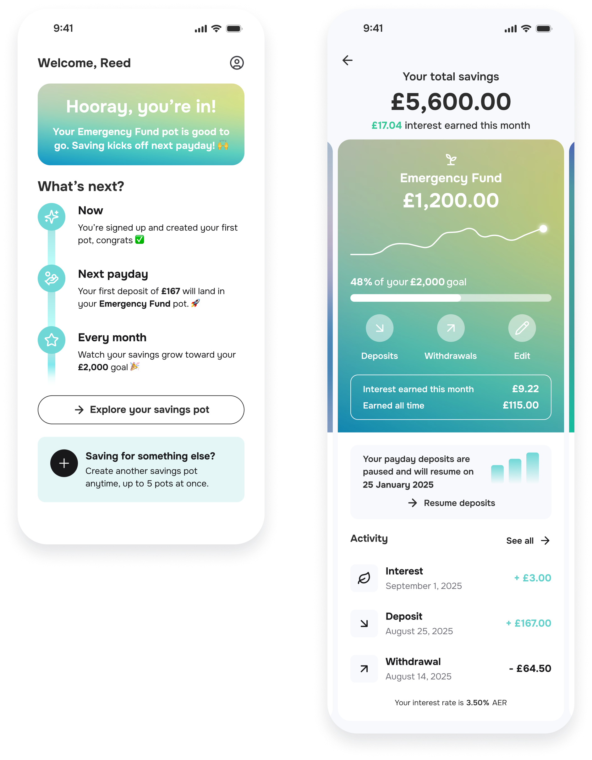
Onboarding Complete screen’s NextSteps, Dashboard’s NextDeposit graphic and Transactions Item’s highlight text
🖱️ Buttons
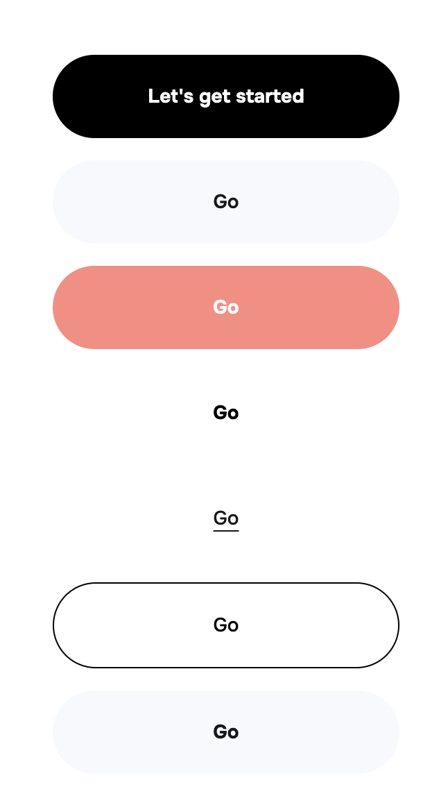
Button (optional) overrides the primary/action button background colour. We recommend leaving this field empty or matching buttons to your app for a truly seamless transition.
NOTE: When using especially light colours, we recommend using Black text by setting the useDarkButtonText variable to YES
Below are some images of our Button palette with different variable arrangements:
 | 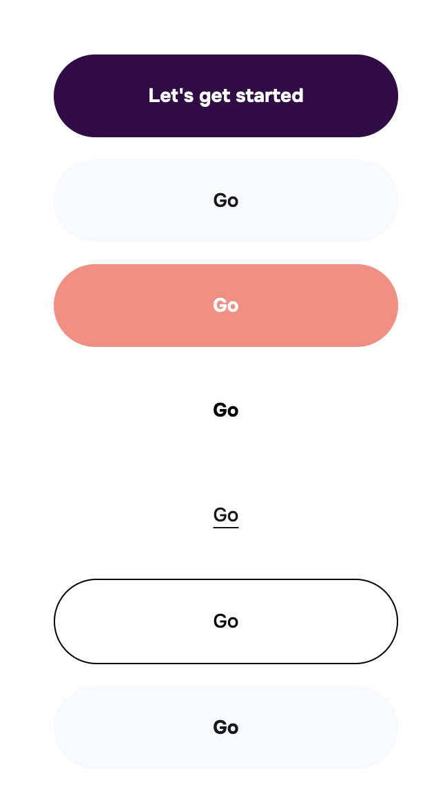 | 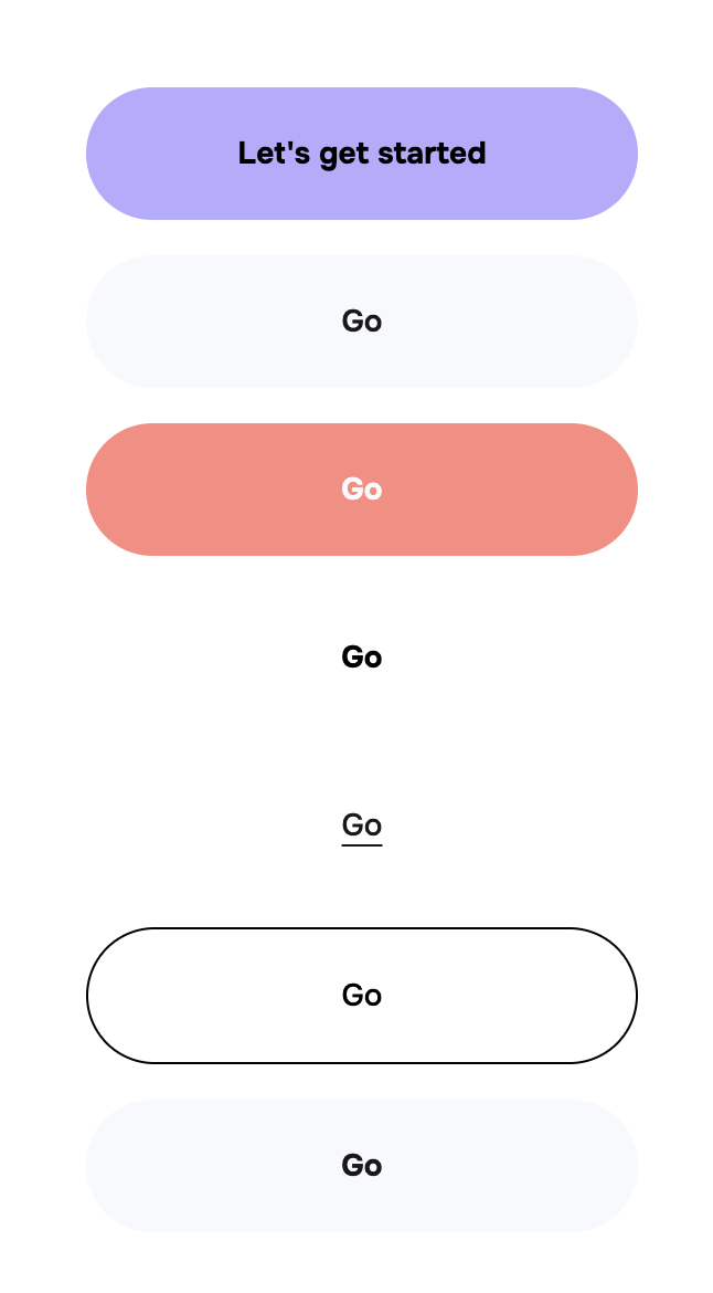 |
|---|---|---|
| Default | Button set to a dark purple and useDarkButtonText left empty | Button set to a light purple and useDarkButtonText set to YES |
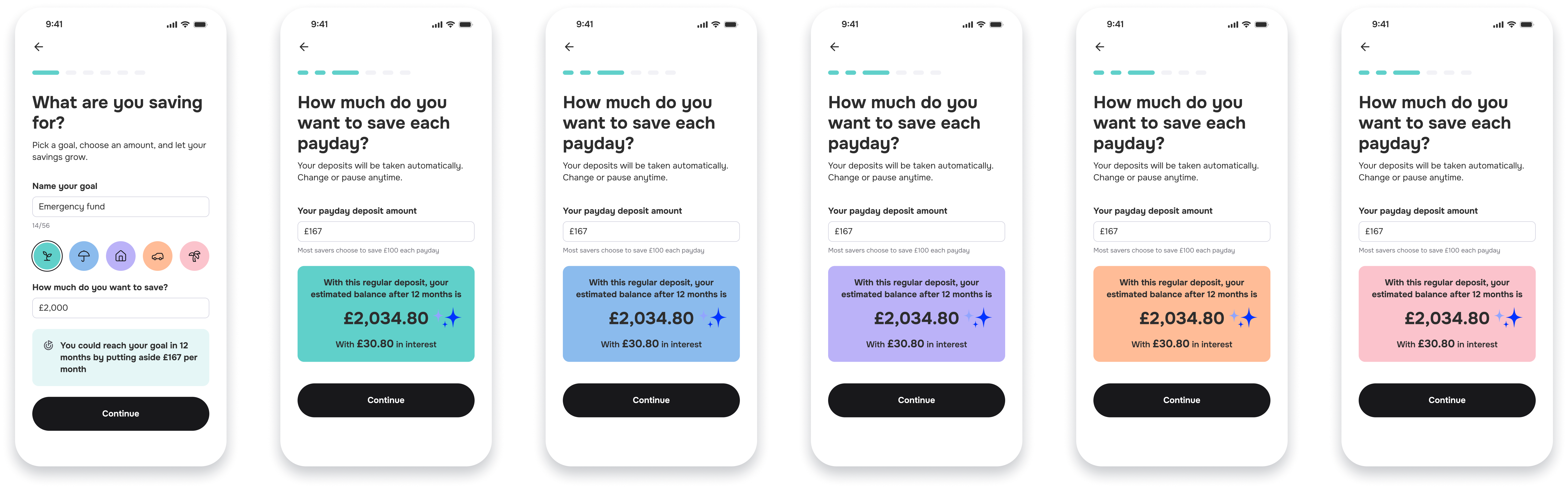
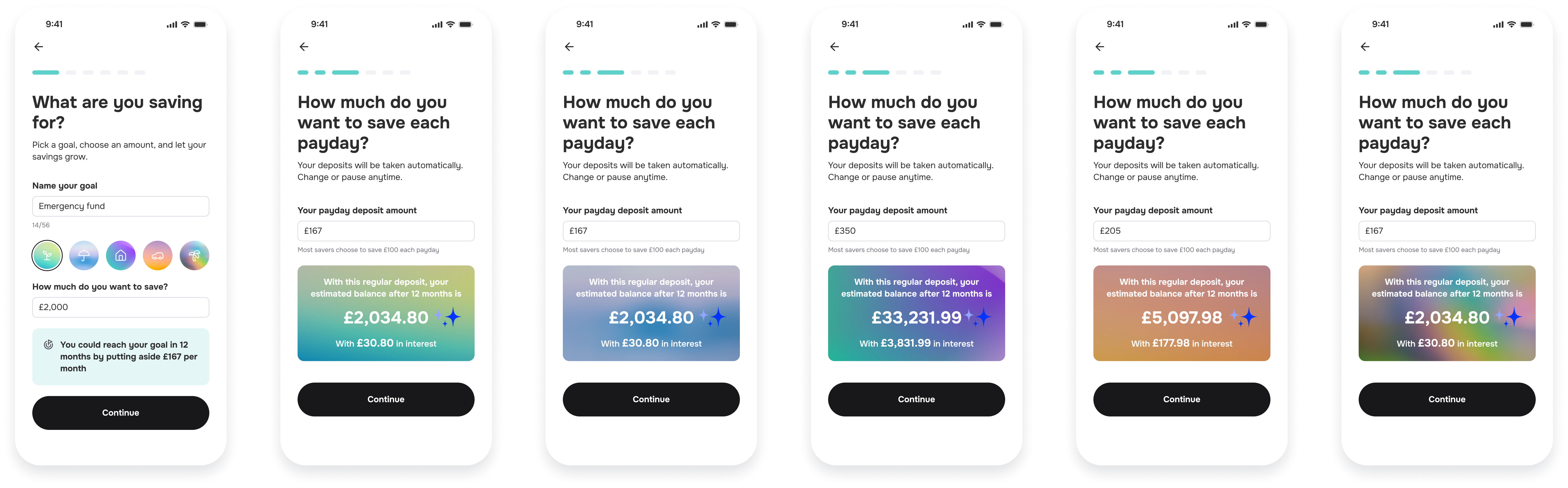
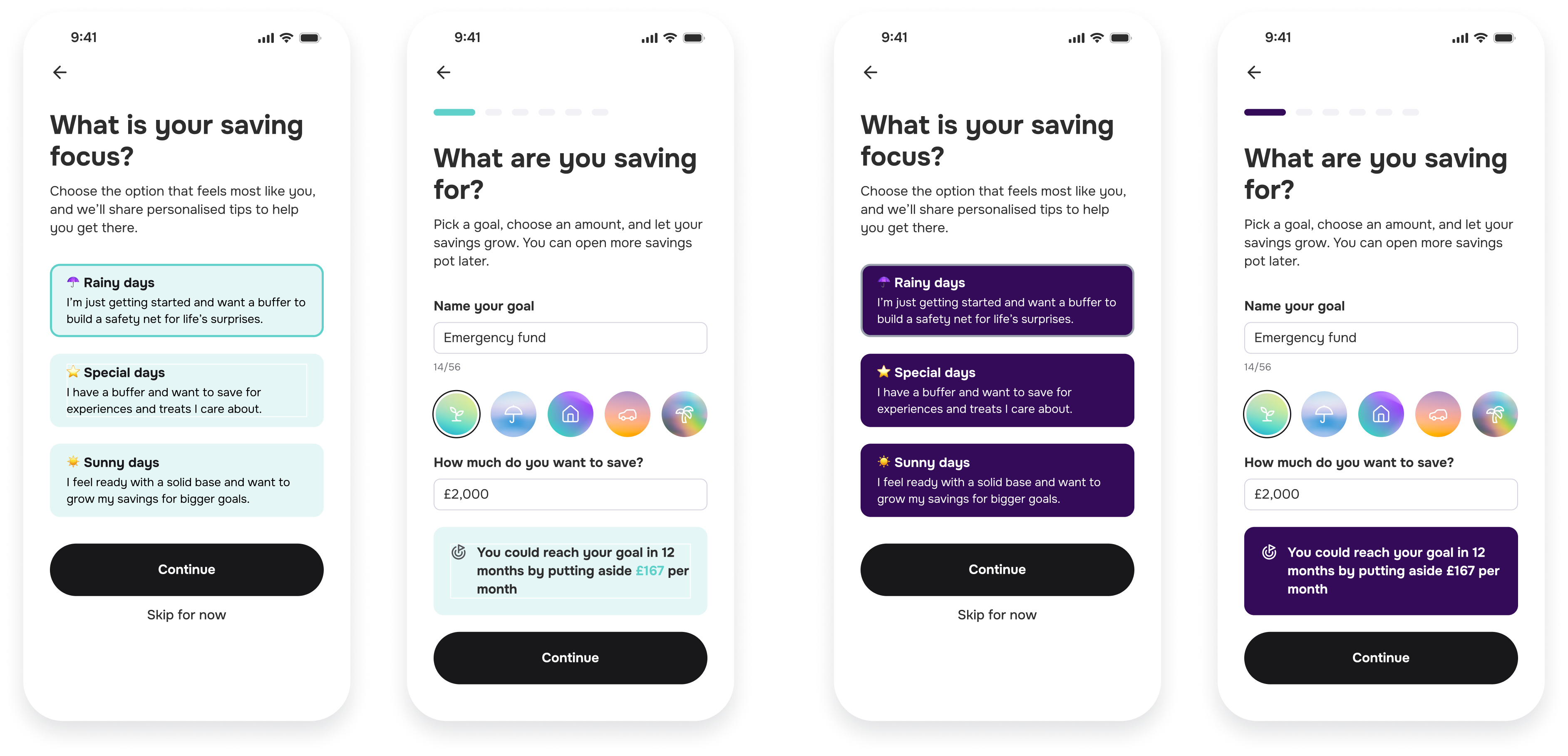
🌈 Account Colours
To highlight account specific information, accounts can be coloured according to a Category. All accounts can be assigned 1 of 5 different Categories:
- Emergency Fund
- Rainy Day
- Home
- Car
- Holiday
There are 3 options for styling your user’s Accounts (Pots). Read below on each of the options and select your preferred option in the Pot field.
1. Sync’s Built-in, block pastels
2. Sync’s Built-in gradients
3. Block Brand colour
NOTE: When using especially dark colours, we recommend using White text by setting the useLightCategoryFont variable to YES
Examples:
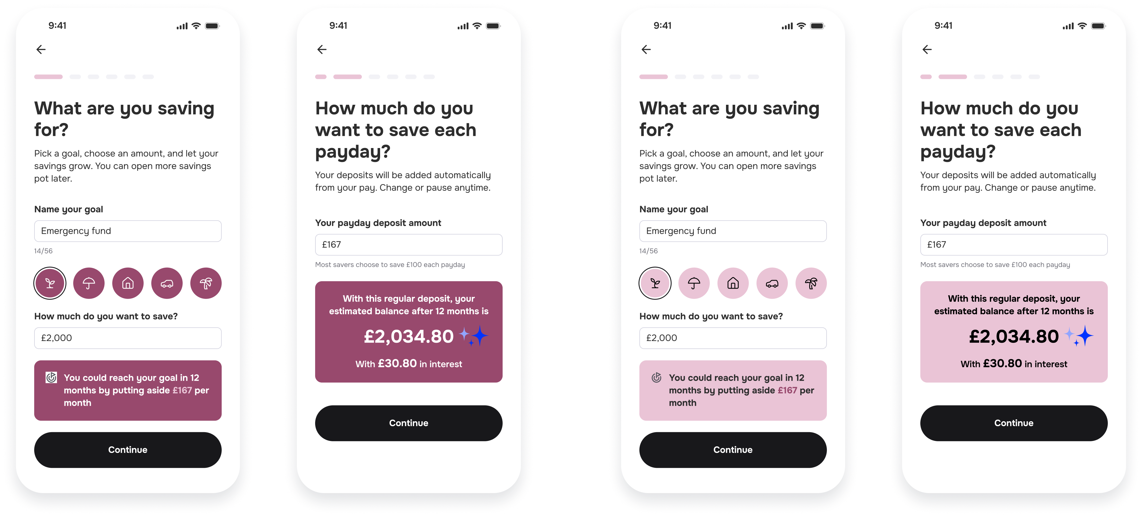
Left - Pot set to crimson and useLightCategoryFont set to YES Right - Pot set to pink and useLightCategoryFont left empty
🪧 Card
Card - Background Colour for Generic, non-Account related (Info) Cards and Boxes.
NOTE: When using especially dark colours, we recommend using White text by setting the useCardLightText variable to YES
Below are some examples of the Card variable in use:
Left - Card set to Sync Accent Turquoise and useCardLightText left empty. Right - Card set to a dark purple and UseCardLightText set to YES
📚 Text
There are 2 primary text groups in the Plugin. Heading and Body. Each of these can be assigned a Font and a default weight. These match the HeadingFamily, HeadingWeight, BodyFamily and BodyWeight variables.
Below is the landing page for all new Payroll Savings Plugin users. We can see an example of Heading and Body text